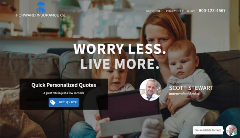
At Leadsurance we have designed, developed, and deployed over one hundred insurance websites.
Every insurance website is unique and has its own requirements and challenges.
However, there are some insurance website design basics that all insurance websites should take note of.
Today I’m going to share the most important insurance website design features to consider on websites for insurance brokers.
Content Management
With so many free website builders out there I’m going to be extremely direct even though I may hurt some people’s feelings saying this.
If your insurance website was free to build, then it is most likely low quality and will never generate consistent quality leads. Insurance websites are missing many features when built on a free platform like Wix, SquareSpace, or the Free WordPress.com version of WordPress (Not the custom domain version).
There, I said it. And I say it with conviction because our team has launched 100s successful insurance websites and so we know what works and what doesn’t when it comes to web design for insurance brokers.
It is said that you get what you pay for and this is true with free site builders.
You don’t get much. Except for checking off a box that says you have a website.
If you really think that using a free website builder and creating your own website is an effective option for marketing your insurance brokerage online then feel free to leave this article and do your thing.
No one is stopping you.
However, if you are serious about marketing your business online, then pay for professional website design and use a professional CMS (Content Management System) optimized for SEO to update and grow your content and traffic.
Without a doubt, the most widely used and supported web design platform and CMS is WordPress hosted on your own domain.
In fact, WordPress powers over 1/3 of websites on the internet today. So, we recommend using it as it is proven to work.

Device Responsive
Over 50% of web traffic today is mobile. This means that only half of your website visitors are using a laptop or desktop computer.
If your site doesn’t respond to the device accessing it then half of your traffic is having a poor experience on your insurance website.
It is critical that your website is responsive to all screen sizes and devices so that regardless of what someone is using when they access your site – they can have a great experience.
Watch your conversion rate double when you simply start serving your mobile visitors with a website that they can actually use.
Contact Info
It should go without saying that your phone number, email, a contact form, and a quote engine should be clearly visible at all times when a user is on your site.
It is fine to have this information down in your website footer, but at the very least make sure your phone number is clearly visible in the header.
Also, make sure your navigation menu has a contact option and an option for getting quotes.
And make sure that the contact info is clearly visible on mobile devices. Many times brokers will put their phone number in the main navigation menu and it appears on desktop computers.
But then when the website is accessed on a mobile device the phone number is no longer visible. This is not optimal at all considering most of your phone calls on your website come from mobile visitors.
We created a mobile navigation bar for our client’s insurance websites that puts a “call” button right by the user’s thumb at all times while on the website.
This makes it extremely clear and simple for users to reach out and call our clients, generating them more leads.
Here is what that mobile navigation looks like.

Site Speed and Performance
Free website builders are slow. Cheap shared hosting is slow.
Slow websites perform terribly.
Slow websites do not convert leads.
This isn’t my opinion, it is factual.
In fact, nearly half of web users expect a site to load in 2 seconds or less, and they tend to abandon a site that isn’t loaded within 3 seconds, according to surveys.
If you don’t take your website’s speed seriously then your visitors probably think you don’t take their business seriously and so they move on.
Can you imagine walking into a restaurant and standing in front of the hostess for a few minutes while she just stared at you without a greeting or an offer to seat you?
That’s kind what it feels like to open a webpage that only partially loads and takes a long time to finish loading.
Just like you’d probably leave the restaurant if the hostess wouldn’t seat you in a reasonable amount of time, you are going to leave the slow website too.
Functional and Value Adding
There are quite a few insurance brokers who build a website for the wrong reasons and thus it never does generate the results they want – inbound leads.
For example, many brokers build a website to simply check off a box and say that they have it done.
Another bad reason to build an insurance website is due to your ego telling you that you need one. I see plenty of ego-driven insurance websites that talk a lot about the broker and agency but little about the policyholders.
Let me make this simple.
Your insurance website should add value to your existing policyholders while also adding value to new prospects.
Sure, you can check off the box saying you have a website and you can stroke your ego a bit by sharing your expertise and accomplishments on your site.
However, the website, first and foremost should be extremely functional and add value for its users. This should be the reason that you build your insurance website in the first place.
Not to check a box or stroke your ego.
But instead to better serve your existing policyholders while also generating more new business.
Insurance Agent Directory and Staff Webpages
As an insurance broker, you will want to showcase your talented team of insurance agents and other staff members that work for your brokerage.
Having an insurance agent directory with pages for each of your insurance agents showcasing their bio, expertise and contact information is a great way to do this.
Try to make these pages personalized by including images, bios, and any other unique information you can include for each of your staff members. Your website is a way to connect with people you’ve never met and build trust, these staff pages are a great opportunity to do this.
Online Quotes (Forms or Chatbots)
Insurance broker websites should have online quoting forms for collecting lead data to run insurance quotes.
Life insurance agents can use something like Ninja Quoter for example.
At Leadsurance we can build online quoting forms for your website and we can also build you a custom insurance chatbot that replaces the functionality of an online quoting form.
The chatbot has a few advantages over traditional web forms:
- Easy for users to engage with where a long-form deters users from engagement
- Provides a personalized conversation that delights the user
- Provides value and pricing information up front before requesting contact info
- On average has a conversion rate of nearly double that of a form
- Can be toggled to live chat for the user to start messaging an agent in real-time
As you can see, chatbots are replacing web forms for the reasons listed above. Major insurance companies have already been using insurance chatbots for years and now even independent agencies can have their own custom chatbot when they sign up with Leadsurance.
Online Customer Service
An insurance broker’s website is comparable to its online office.
Especially after COVID-19 when more and more policyholders and consumers are searching for insurance help online.
The best way to think about your online customer service is really to think about the same customer service you’d offer in person in your office and then translate that digitally to your website.
-
At your office, you likely have an assistant or some employee who greets people when they enter
- Online you can have a live chat or chatbot that greets new visitors to your website
- On your website, you can create blog content, FAQ resources, live chat answers, videos, informational graphics (infographics) and more to answer preliminary questions
- Your phone number should be clearly visible on your website as well
- Online you can also use web forms to collect policyholder information and you may also consider using a chatbot or live chat as well.
These are just a few of the primary ways that you can transition your customer service offerings online to your insurance brokerage’s website.
Insurance Marketing Videos
Reading text isn’t everyone’s favorite method to consume content and each year marketers are noticing an increase in video consumption.
You can educate your customers and market your products and services through videos on your website.
Video content has the following advantages:
- Videos engage your audience more than any other type of content and therefore have the opportunity to really connect and build trust.
- Also, according to HubSpot 4x as many customers would rather watch a video about service than read about it. (covideo.com)
- Statistics reveal that more than 80% of online traffic will feature videos by 2021, and through video marketing, you are 53 times more likely to be found on search engines’ first page. (joinstratosphere.com)
- On YouTube, users upload 300 hours of video every minute, and viewers watch nearly 5 billion videos daily, according to Merchdope Viewer preferences and habits rule the search result rankings on YouTube. (programbusiness.com)
As you can see, creating some insurance marketing videos is definitely a strategy worth considering.
Statistics on Websites for Insurance Brokers
Here are some statistics on websites for insurance brokers that will help you understand what makes them effective at generating leads for your insurance agency.
- 74% of visitors are more likely to return to mobile-friendly websites
- 61% are likely to leave if a site isn’t mobile-friendly
- 67% are more likely to buy at a mobile-friendly website
- If it takes your website more than 5 seconds to load, your potential customers are extremely likely to jump ship
- Also, after watching a video, consumers are 64% more likely to purchase a product or service online
- 72 percent of consumers prefer email as their source of business communication.
- According to research, more than 85% of people who buy products online will research extensively, and review at least 10 different sources before they make a buying decision.
These statistics on websites for insurance brokers come from blog.newhorizonsmktg.com and recamp.com.
Over to You
There you have it, 10 tips on websites for insurance brokers.
Although I wouldn’t recommend you try building your own website, I would recommend taking these tips into consideration with the professional web design company you hire.
At Leadsurance, we build high performing modern insurance website designs that convert more of your visitors into exclusive warm leads for your brokerage.
We are happy to answer your questions about insurance broker websites in the comments below.
Share your insurance brokerage’s website in the comments below and let us know which of these tips has helped you the most.


