Web design should always be data-driven and never executed based on opinions.
When considering the top 6 life insurance website design criteria, we looked strictly at the data from our experience working on and analyzing insurance sites.
Today we are going to share our findings of the top design criteria for your life insurance website.
Functional Criteria for Your Life Insurance Web Design
Figuring out the functional criteria for your site is fairly straightforward.
Ask yourself: who are your visitors and what do they need from your site?
To keep it simple at first, you can group visitors into 2 buckets: current customers and prospects/consumers.
Then just list the main reasons these groups visit life insurance websites.
The 3 main reasons are:
- For a consumer to shop quotes
- For a customer to get help with their Policy/Claim
- For anyone to get questions answered and educated on insurance topics
So, the top 3 design criteria are:
- Incorporate instant quoting with lead generation
- Offer a policy/claims/support center
- Include a platform to create and update educational content
There you go.
Your top 3 design requirements for your life insurance website.

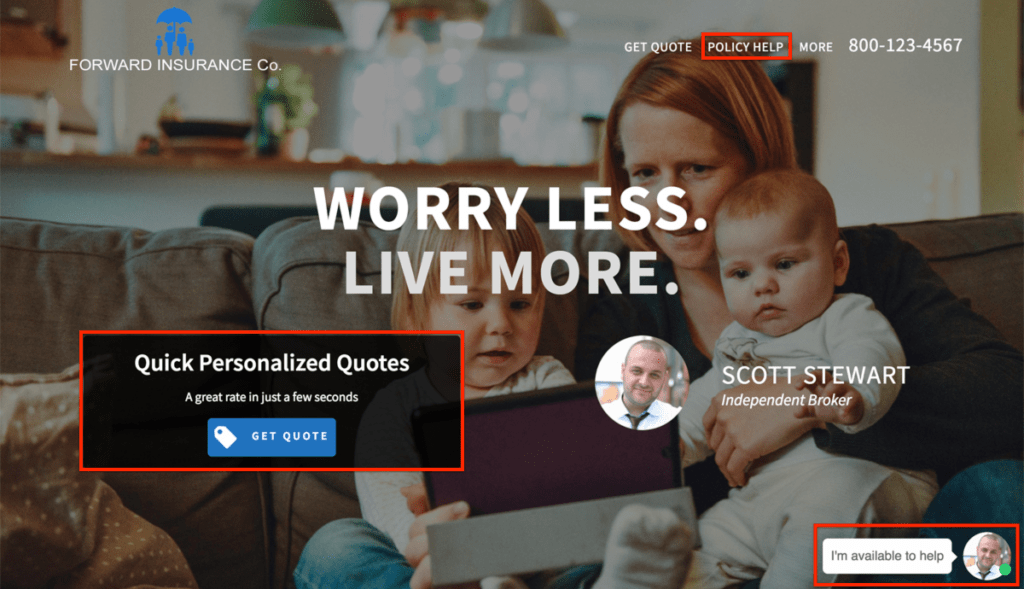
To give you some ideas, here is how we tackled these 3 design criteria for our client’s life insurance websites:
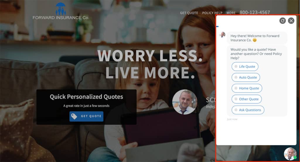
- We install and optimize our chatbot programmed to engage visitors and offer instant quoting help while capturing lead info
- We build out a custom policy help center with instructions for clients to get policy and claims support online
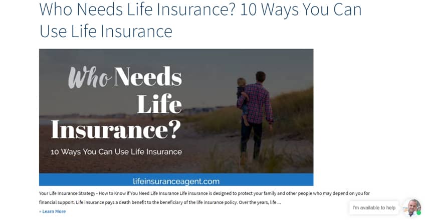
- We integrate a blogging platform that we create custom branded informational/educational content for

Above is our chatbot engaging a visitor. And below is our educational content that attracts visitors to the site.

There are more ways to meet these design criteria. But we have found these to be most effective when implemented properly.
Now that you have plans to provide your site visitors with what they are looking for, let’s make sure to execute them in the best way possible.
Which leads us to our next 3 insurance website design criteria.
Responsive Design, User Experience and Performance Criteria
These are design requirements that are crucial to all websites nowadays.
These are general website functionality requirements that Google has stated are important to rank in their search results.
Why?
Because these requirements focus on the user experience. And Google is also focused on the user experience.
So, to keep your visitors and Google happy, it is important to include these next 3 life insurance website design criteria.
- Responsive design for mobile tablet and desktop
- User Experience (UX) optimization
- Speed and performance optimization
According to Statista,
52.2% of all internet traffic in 2018 is from mobile devices.
And this number is growing by a few percent each year.
So, Google favors websites that offer a great experience to their mobile visitors.
In fact, it wasn’t long ago that Google created a second search index that caters entirely to mobile traffic.
This means having a design that responds to different device screen sizes and looks and functions great on each of them will rank higher in Google and get more traffic.
It also means that the better the design is in general for users to access the information they want quickly, the better it will rank and get more traffic.
Finally, the faster each page loads leads to better rankings and more traffic as well. But more importantly, all of these improvements along with better speed will please your visitors and increase conversions of visitors into leads and customers.
According to Hubspot,
47% of customers expect a webpage to load in 2 seconds or less
Basically, by having a well designed and fast high performing website, you will be attracting more visitors to engage your site and Google to send more visitors to your site.
Life Insurance Websites That Go Above and Beyond
Life insurance website designs that incorporate each of these top 6 criteria are guaranteed to perform better than competitor sites lacking these criteria.
The quicker, easier, and more pleasant experience you can create for your website visitors – the more leads and customers your site will generate.
Let’s recap the top 6 criteria for life insurance sites and why:
- Instant quoting for prospects who come specifically for a quote
- Policy/Claims support center for customers who come specifically to access their policy or file/update a claim
- Educational content platform to educate both prospects and current customers on various insurance topics
- Responsive design to serve the 52.2% of your traffic on mobile devices as well as your desktop and tablet traffic
- User Experience (UX) optimization so that your users can quickly find what they are looking for
- Speed and performance optimization to rank higher in Google, get more traffic, and convert more leads
Leadsurance creates data driven web designs for life insurance agents and agencies customized to your brand.
Our goal is to incorporate our effective data-driven design criteria seamlessly with your branding.
We always include all top 6 of the most important life insurance website design criteria and more in our client’s websites.
We don’t stop at designing life insurance websites, we also automate them by optimizing for the best life insurance keywords, adding custom branded blog content, and posting consistently to your social media profiles.
We even built an insurance chatbot that works 24/7 for life insurance agents, included in all of our packages.
Our solution offers instant quoting for your prospects and lead gen for your agents.
So, if you need a life insurance website, or want to take yours to the next level, then you should get a demo now to see the data-driven design for life insurance that Leadsurance offers.
I hope you found this article helpful and got some good ideas for your website. Thank you for your time!
Comments or questions about life insurance websites? Let’s discuss them below.


