Insurance Web Design Ideas
Using the arrow buttons you can scroll through and click the images below to see various insurance website designs to give you inspiration and ideas for building your insurance website.
When you’re ready to get started, we would love to help you build your dream insurance website that targets your ideal customers.
Intro to the Insurance Web Design Guide
Key Takeaways
- Mobile first design will be more important in 2025 and beyond
- Speed and performance will become more important for SEO and conversions
- User Friendly design and UX best practices are increasingly important
- Unique and branded content that is useful to your target audience is essential for SEO and conversions
If you own an insurance agency then aside from referrals, you know that your best inbound lead channel is your insurance website.
Insurance agents are rockstar advisors but not web designers in most cases.
So, we created this in-depth guide to insurance website design to help new insurance agents build their online presence while also helping growing agencies improve.
This guide is going to cover everything from registering a domain and comparing insurance website design templates to analyzing your website data and optimizing your UX, Content, SEO and other factors.
That means that whether you’re building your first insurance website, or you’ve been in business 30 years and are in the process of upgrading your current insurance website design, this is the guide for you.
Remember, if this all seems like a lot, (sorry, I know it is) then you can Get Leadsurance.
There is a lot of information in this guide, so you can use the table of contents below to jump directly to the sections relevant to your insurance website design objectives.
Grab a cup of ☕and let’s get started!
Already have a domain and hosting? Jump to the Web Design Process Section
Domain Registration
Plenty of agents come to Leadsurance without owning a domain. We can offer you a subdomain if you are not comfortable registering your own domain.
However, we highly recommend that you register your own domain. Here is why:
- Branding – get a domain that matches your brand
- Traffic – your own domain is going to perform better than a subdomain
- Conversion – People trust branded domains and are more likely to convert
- Investment – A domain costs around $10/year and then you own it and can continue investing in it year after year
Think about your potential clients and what they would search online to find your services or information about your insurance products. Really understanding how your potential customers think and use the internet is the first step to choosing a great domain name that will be visible online and well branded.
Using a Registrar
There are way too many domain registrars for me to list them all. I’m just going to share the main one that I personally use and one other that many of my clients use. These are trusted domain registrars.
- Namecheap
- GoDaddy
As you visit these registrars you can begin searching for available domain names. Here are a few things to consider when registering a new domain.
Choosing a .tld and Domain Name
.tld (Top Level Domain) refers to the ending of the domain, ie: .com, .net, or .org. In most cases, choosing a .com .tld is what a commercial business should choose. Consumers view .com websites as commerce websites for doing business.
That said, .net could be a close second. If your domain isn’t available at .com you could consider registering it at .net.
Registering a Dropped or Auction Domain
That last thing I want to mention is a Pro Tip that not everyone will be able to implement.
Brand new domains take a while to build trust, authority, and traffic. In fact, Google admits to ‘sandboxing’ new websites for 6 months. In other words, they suppress visibility and traffic to domains in their first 6 months online.
Google does this for quality control to combat spam sites that pop up overnight.
There is a little workaround that I will share for the Pros out there and it involves registering an auction domain.
You can find domains that are for sale in auctions, these domains are aged with history and will begin receiving traffic much quicker than a brand new domain.
The caveat is that it can be extremely hard to find a relevant domain for your business that you can also afford. However, sometimes you can find a golden nugget.
Here is an auction domain search tool you can use to go mining for these golden unicorn domains.
Great, now that you have your insurance website domain registered, let’s talk about choosing a host for your website.
Key Take Aways
- Use a well-known registrar like Namecheap or GoDaddy
- Register your brand name for the domain
- Try to secure a .com domain if possible
- Consider registering a dropped or auction domain for getting traffic quicker
Web Hosting
When it comes to web hosting, speed and uptime are king.
There aren’t many specific factors, outside of these two, to consider when hosting insurance websites.
Really the only thing that is completely specific to an insurance website that you should consider is security.
So, just make sure you buy SSL certificates each year for your domain and install them correctly securing your pages.
Security is most important for when you plan to collect sensitive policyholder information through your site but it builds trust and increases conversions as well for better lead gen.
Aside from security, the most important things to consider in choosing a web host for your insurance website are speed and uptime.
At Leadsurance, we understand the importance of good hosting. Hosting is the foundation that your website is built on.
Problems with your hosting can mean that your website is completely inaccessible, slow, or not functioning properly.
For this reason, we have partnered with the highest performing and most reputable web host online, WPEngine.
Let me share a bit about how and why we chose WPEngine, and how you can choose a web host for your insurance website.
Choosing a Host
Like I just mentioned, you mostly want to choose a host based on speed and uptime.
Most hosts claim 99.9% uptime, but it is good to check on customer reviews to make sure they aren’t complaining about downtime.
As for speed, you can find speed comparison articles comparing web hosts. You can also use speed testing tools to test sites that are hosted on various hosts.
Find some of your competing insurance websites and enter their domain here to see what hosting they use on these sites:
- hostingchecker.com
- whoishostingthis.com
Make a list of your competitors that use hosting you are interested in. Then let’s compare their site speed performance.
Here are a few speed testing tools to use:
- GT Metrix
- Pingdom
- Google Pagespeed Insights
One thing to note is that the variations you find in speed will not only be due to hosting. There are many other factors at play and each of these websites has different variables to consider such as page size and the number of HTTP requests for example.
Like I already mentioned, you can find speed comparison articles comparing web hosts. These comparisons are best when the author uses multiple hosts for the EXACT same website.
This controls all of the variables so that you can just focus on hosting to see which performs best.
You will find that nearly everyone online agrees, WPEngine is the best performing web hosting for WordPress websites.
Working on Your Server
Another reason WPEngine is great is that it doesn’t force you to use Cpanel, a dated web host platform.
If you have already been using Cpanel for years, then maybe this isn’t an issue for you. I felt the same way as I have many years using Cpanel under my belt.
Then I met WPEngine… and wow it is so much cleaner and easier to use.
Here let’s compare screenshots of Cpanel vs WPEngine.
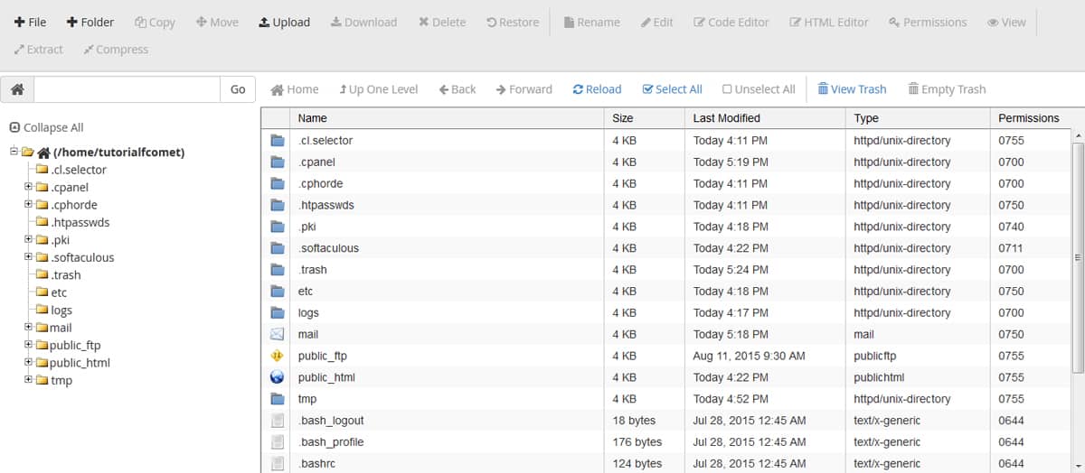
As you can see, Cpanel can be difficult to navigate making it hard to manage.
With Cpanel, you have endless folder directories and about 100 different clickable elements on each screen
You will also need to become familiar with FTP setup and protocols if you plan to use CPanel, which also requires some technical learning curve.

With WPEngine, the design is extremely clean and intuitive saving you time managing your hosting account.
You simply view a list of your websites, their average traffic numbers, and storage usage with simple navigation for taking actions. The most important information is directly accessible and navigating from here is a breeze.
With WPEngine, you have FTP as an option, but you will rarely (if ever) need to use it. WPEngine is managed WordPress Hosting which means it comes with a super clean simple and easy to use interface.
Plus you have a support tech standing by 24/7 to help via live chat.
✌️ Bye cPanel.
🤗 Hello WPEngine.
The last thing I will mention is hosting support. In the unfortunate event that you have a hosting issue and your website goes down, you are going to feel a lot of stress and anxiety.
If you don’t have active and helpful support standing by then this stress and anxiety will just compile as you continue to miss out on new business and receive negative emails from clients who can’t access your site.
WPEngine has 24/7 support that will respond to you within minutes to make sure you get the help you need. This alone is worth the premium fees you will pay for their hosting service.
Key Take Aways
- Choose a host based on speed, uptime, security, and budget
- Make sure you can master cPanel and FTP otherwise invest in a Managed WordPress Host like WPEngine
- Purchase and install SSL certificates annually to ensure your website is secure
- Test the hosting providers support before buying, to make sure they’ll be there for you in an emergency
Insurance Website Design Process
You can easily spend upward of $2,000 on a nice custom insurance website for your insurance agency.
Of course, you can also create a free insurance website using something like Wix.com
You get what you pay for.
Which is why I am going to stop talking about free website builders right here and right now.
If that is your game plan, then all I will say is, good luck.
You won’t find any advice here on using free site builders because my only advice about them is pretty simple.
Don’t use them.
The guide you are reading is for serious business owners who are strategically investing in their digital assets.
If you want free, then go ahead, create a free Wix site and let me know in the comments below how many exclusive leads your site generates.
We really only recommend free builders for temporarily getting or keeping your business online, we never recommend using insurance website builders as a long term strategy. It is always better to hire a professional to develop and maintain your website than to use a free tool to DIY.
Now that my rant is over, I will say this:
Starting out, there isn’t a need to spend thousands on a custom insurance website, you wouldn’t even have all of the data required for the design team to execute the build.
It is better to build a simple and effective website at first and over time continue to develop it and add more content and functionality as needed.
In fact, Leadsurance offers custom insurance websites you own for life, starting at just $949.
And I am about to teach you how you can build your own custom insurance website using whatever budget available from a couple of hundred dollars to thousands.
Choosing an Insurance Website Theme
You are the lead on this build, we are just providing the guide.
With that said, if you are going to build your own website, then I highly recommend that you use WordPress to build your website.
It is a free CMS (Content Management System) that powers over 30% of the web making it the most popular choice.
It is highly customizable and so it can grow with you over time as your website needs development and it is backed by a huge community offering support.
I’ll let these stats convince you to use WordPress:
- 30.3% of the top 1,000 websites on the internet are built on WordPress
- 30% of the internet is built on WordPress
- WordPress is visited more than Twitter
- WordPress has nearly as many employees as Amazon
- WordPress has 44,621 plugins to extend your site
- WordPress 4.5 has over 20,000,000 downloads
I’m going to assume you are choosing WordPress for your CMS because I know you are a smart cookie.
Why make it hard on yourself and choose a lower-performing CMS with lacking theme options and little to no support?
Great, I’m glad you agree.
With that decision out of the way, let’s take a look at insurance website design templates known as WordPress themes.
Best Insurance Website WordPress Themes
Let’s go over the top insurance WordPress themes for you to choose from. These themes will be your insurance website design templates to choose from.
Then you will have to install them, edit and customize them, and maintain and update them.
First, I’m going to quickly share some screenshots of sites built on the Leadsurance platform because it is cheaper, quicker, and more effective than any of the other insurance website design template, theme, or design option you’ll find.
Plus, we may be biased, but we think our insurance sites look the best.
Then, I’m going to share 12 pre-built insurance themes for WordPress that you can customize within reason using a modest budget of about $250 – $1,000 plus some of your time every day to update, maintain and optimize.
Your basic options are:
-
- Pay insurance website design companies $1,000 – $5,000 for a custom website design.
- Spend $250 – $1,000 on graphics, design tweaks, content and other services plus a lot of your time making limited customizations and maintaining a pre-built generic insurance website template that thousands of other agents are using.
- Get Leadsurance setup in 30 minutes and live in 1 week, starting at $949 one time payment. Our team builds a custom insurance website design just for you, or your entire agency.
Then we maintain and update it, create custom branded content for it, automate your social media, engage visitors with our chatbot, give you a real-time analytics dashboard and lead alerts and so much more.
We hope Leadsurance is a ‘no brainer’ when it comes to insurance website design. View Complete Cost Comparison
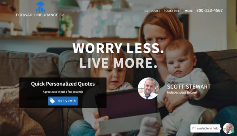
Below are a couple examples of independent agent and agency group websites that we have built for clients.
Leadsurance ‘Independent Agent’
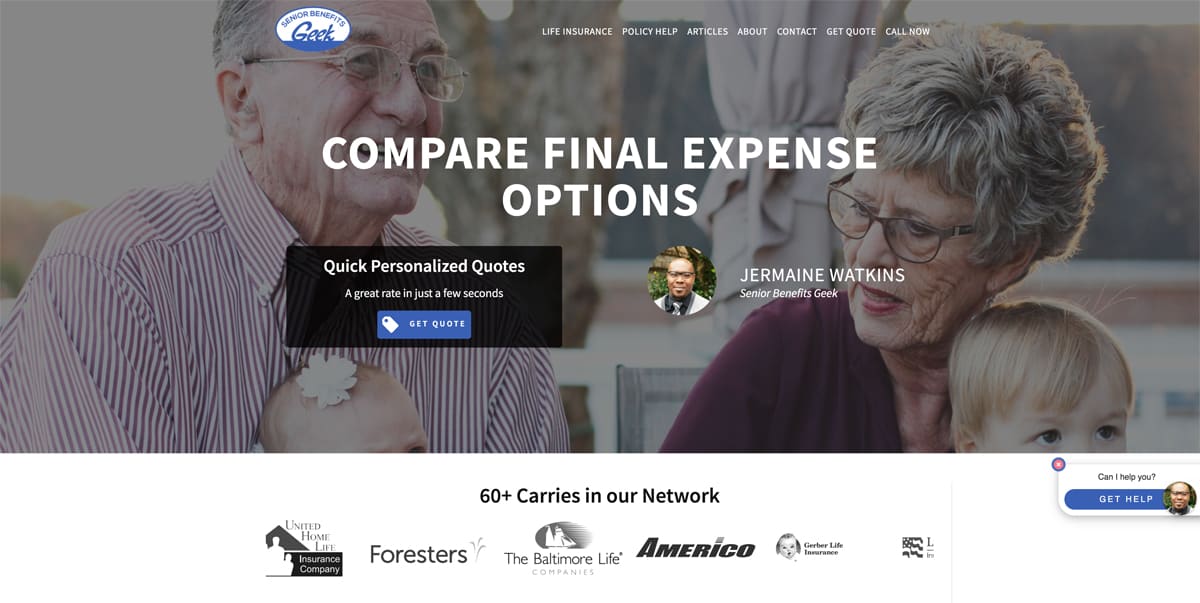
Leadsurance ‘Agency Group’
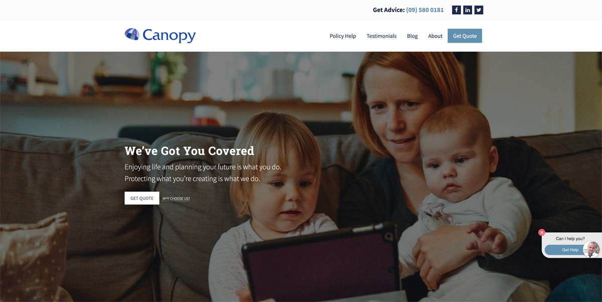
Go to our homepage to see some more website examples.
Leadsurance is more than a theme or even an insurance website, Leadsurance is a complete web presence that is dead simple to set up and manage.
At Leadsurance, we built our platform using the best coding and design practices, achieving the fastest loading times, and building SEO into every component of the platform.
For these reasons, Leadsurance sites have great SEO and perform well in search engines.
When you login to Leadsurance to view your analytics, you will see growth in traffic.
Ok, let’s move onto the pre-built insurance themes for WordPress that you can customize within reason using a modest budget, resources and amount of time.
If you have experience installing WordPress, uploading themes, adding plugins, and adding content, then you can buy these themes and customize them yourself in a few days or weeks depending on your skill level and schedule.
Most insurance agents that I talk to do not have the skillsets to do all of this.
If that is the case then you can get Leadsurance or hire an insurance website design company to assist you.
You can compare insurance website design companies and shop around to see what works best for you.
As they say, there’s more than one way to skin a cat.
How you go about your insurance website design will all depend on your skills/resources, goals, and budget.
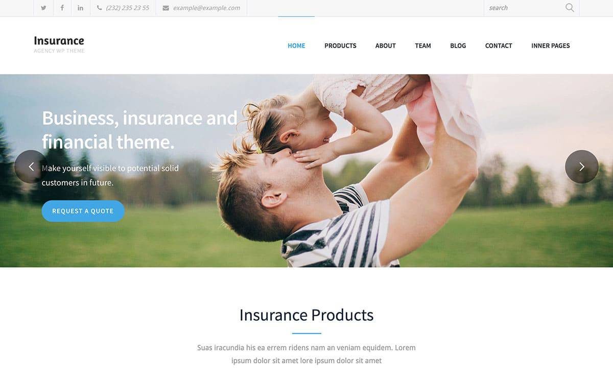
‘Insurance Agency’ is a versatile multi-purpose built WordPress theme that will help you easily build an eye-catching and professional website for your business.
There are actually two website demos that come with this WordPress insurance theme. You can either import the multi-page traditional demo into your website. Or, there is a one-page version that you can use instead. The one-page layout can be especially effective if you want to display all of your best characteristics and offering on your website’s front page, instead of just hoping visitors will click through to explore your site’s inner pages.
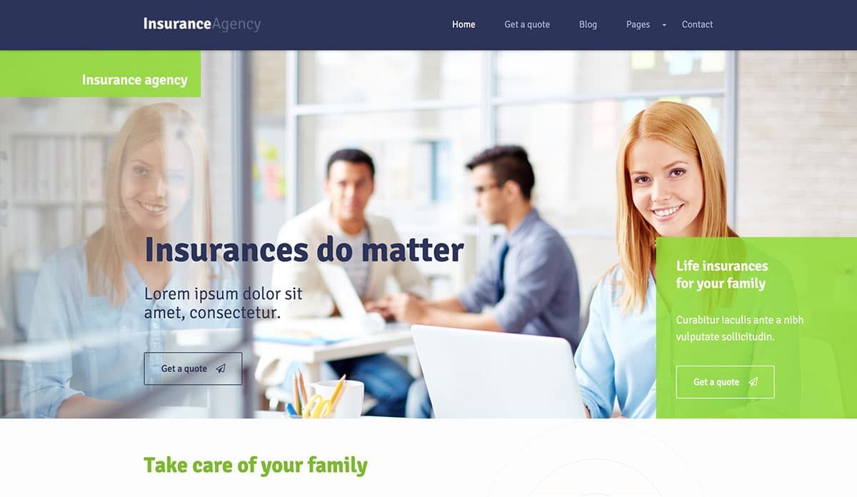
‘Insurance’ was developed to help everyone involved in the insurance industry create a professional website from full-scale agencies to self-employed agents and everyone in between the two ends of the scale.
The main homepage demo offers an appealing and bright appearance while still providing a website with a professional image. When creating your insurance website using this theme and WordPress, you will have the option of having a full-screen background image slider displayed on the homepage. Due to the way the theme works, you can overlay the homepage slider easily with custom welcome text to help you connect with your audience instantly.
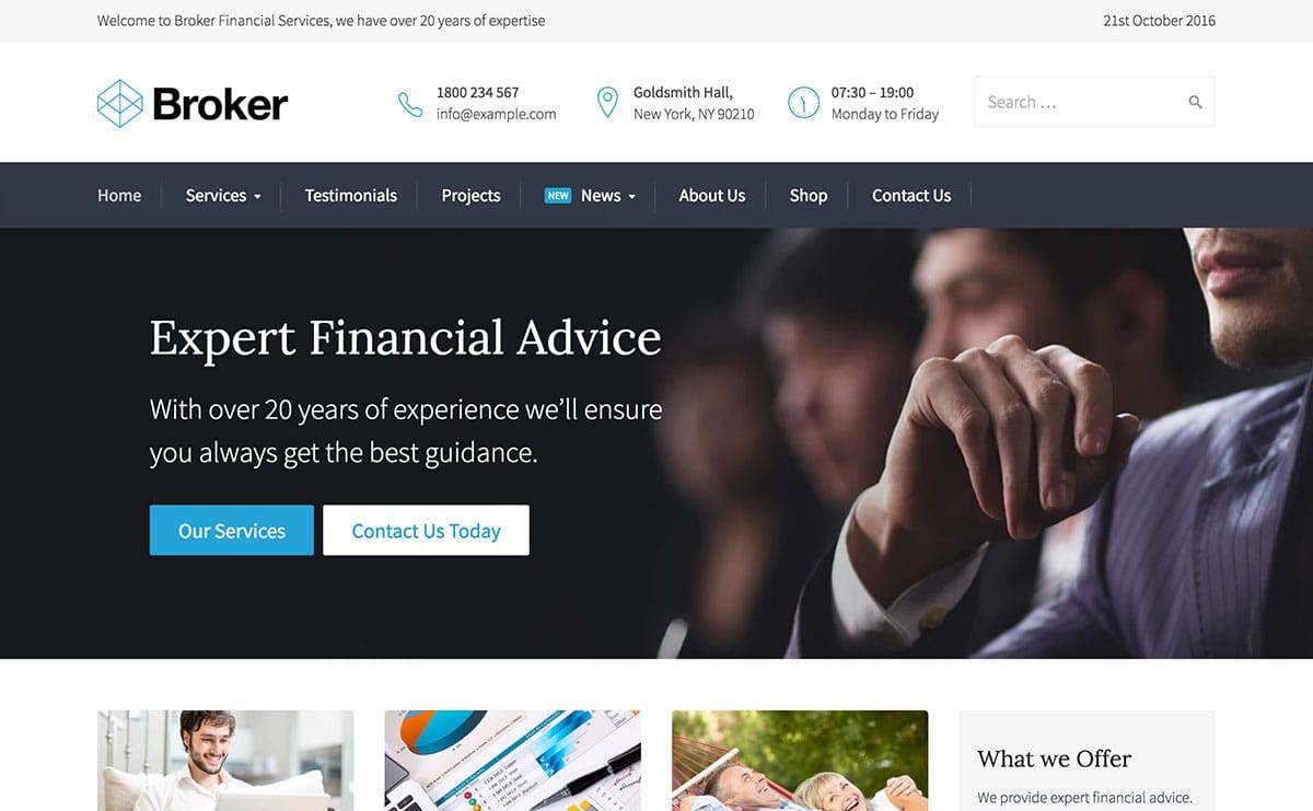
‘Broker’ claims it is ideal for any business and can easily build a great looking insurance WordPress website.
If you are new to using WordPress or creating websites, its one-click demo important can help you get your website set up very easily. The Broker demo, unlike many other WordPress themes, comes with realistic content instead of merely placeholder text. That gives you the advantage of having a clearer idea of where to add content when you are editing the material on the demo.
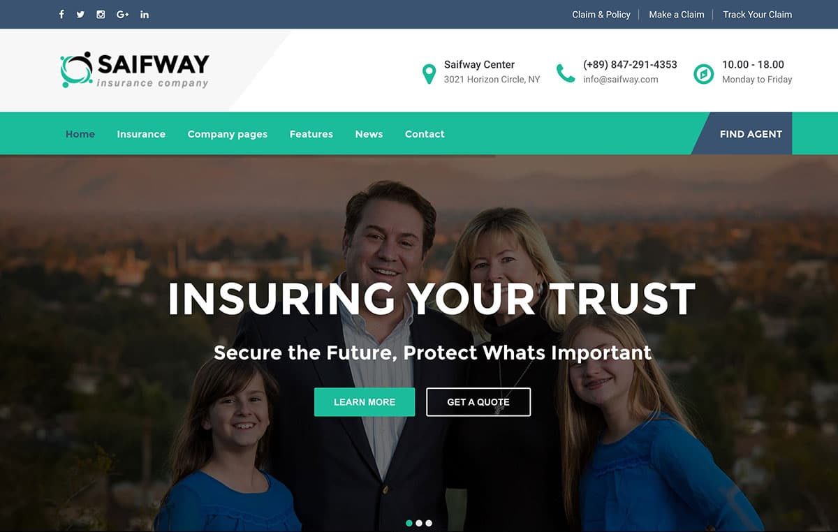
‘Saifway’ is a genuine multi-purpose insurance WordPress theme that offers a nice selection of homepage demos.
The pre-built content that comes with Saifway will allow you to use this theme to build any kind of insurance agency website. No matter which demo you choose, your website by default will include a number of current popular web design trends and elements.

‘InsuRel’ is a fully functional modern WordPress theme that allows you to create professional and versatile insurance websites.
InsuRel is not only a good option for insurance companies, but it also can be used for tax-related, legal, and financial firms. Therefore, no matter what kind of professional service website needs to be created, InsuRel could be exactly the theme you need.
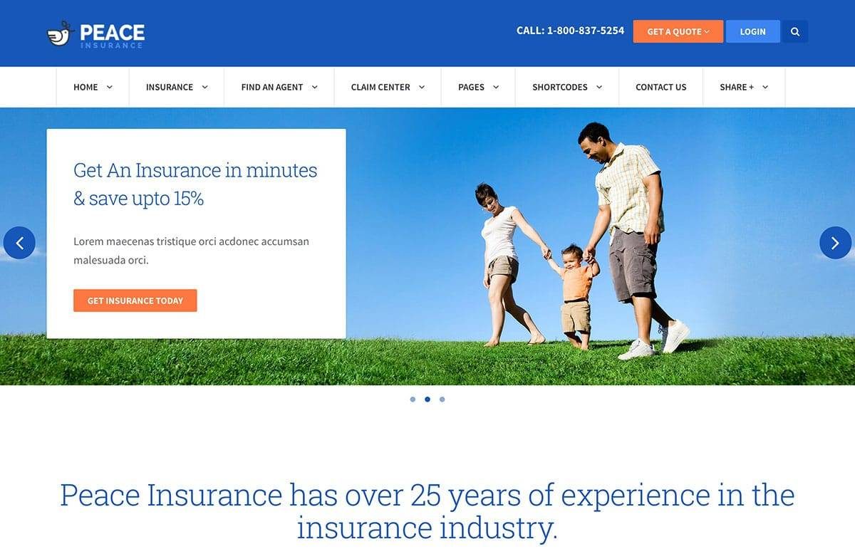
‘Peace’ offers a good selection of different pre-built modes and settings to meet all of your insurance website needs.
To help to ensure that your business branding is matched by your insurance company website, there are a number of different color schemes to select from along with the ability to create custom color palettes quickly and easily for your website. It is also easy to customize other aspects of your site as well, thanks to the drag-and-drop Visual Composer page builder plugin that is included.
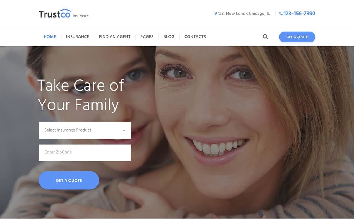
This ‘Insurance Agency’ WordPress theme from Ancora Themes is one of the latest options in this insurance WordPress themes collection.
Like many of today’s most popular themes, Insurance Agency comes with a homepage slider that features animated effects to help grab your visitors’ attention. However, if you don’t have the right content to populate a full-screen slider or you are just not a fan of them, this feature can easily be disabled by just touching a few buttons.
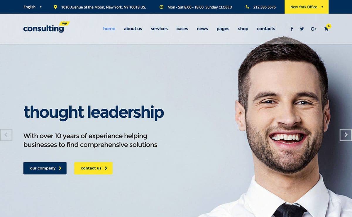
The highly flexible ‘Consulting’ WordPress theme caters to insurance agencies as well as business and finance organizations.
With Consulting, you will be spoiled due to all the choices that are available to create an insurance website. There is a total of 18 demos for you to choose from, many which are ideal for insurance service website, and some others that just need a bit of minor tweaking to make a great match.
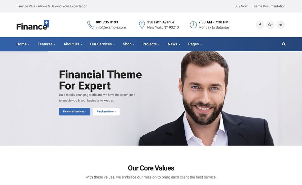
‘FinancePlus’ is a multi-purpose business/financial WP theme offering a wide range of features and options that are great for insurance websites.
The FinancePlus theme comes with five homepage designs to cover a broad range of projects. Since none of them are very specific in their focus, all of them make good choices to use with an insurance business website. Also, since it comes with the Visual Composer page build tool, 6 header layouts, and 12 preset color styles, it is easy to customize all of the five demos.

A wide range of various business-focused websites can be built with ‘Finance’.
There are a number of different homepage options offered by this theme, including one that is a great option for insurance websites. There are also other homepage variations that are well-suited for accounting, consulting, and financial related projects. However, any of the designs can be easily customized to suit your needs better.
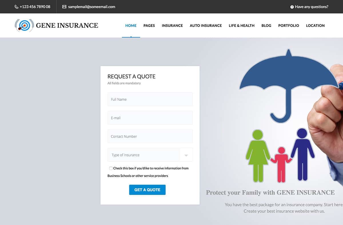
‘VEDA’ is a genuine multi-purpose WordPress theme that offers more than 200 website demos, including a couple of good options to use with an insurance website.
In fact, VEDA adds new demos regularly which makes this theme suitable for a broad range of different projects. If you are wanting to build an insurance website, VEDA offers plenty of business-focused demos to choose from.
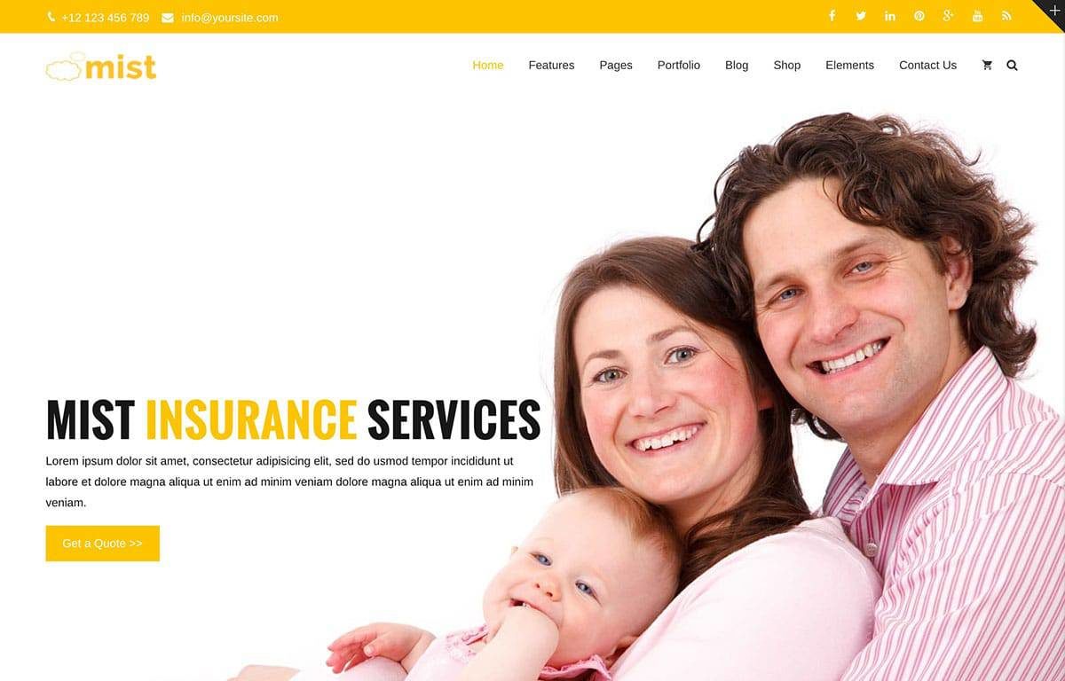
‘Mist’ is a multi-purpose WordPress theme that also offers a good selection of demos that are well-suited for insurance websites.
The Mist website demos include one that was built specifically to create insurance websites. There is a full-screen content slider featured in the insurance demo that helps you engage your visitors, a tool to help you publish client testimonials, and modules for explaining your services. Like all of the other demos that Mist offers, you can easily personalize, customize, and rearrange the insurance option in a number of different ways.
Customizing Your Insurance Website Design
Once you have chosen a theme for your WordPress site, the fun part begins.
First, you will need to install WordPress and install your theme. You might need to hire a developer to help you with these processes if you are not technically savvy.
With WP and your theme active, you can begin customizing it. Every theme is different so I can’t provide specific how-to instructions.
However, I can provide a list of basic customizations that you’ll need to make to every new WordPress site and theme.
Insurance Website Customizations
- Site Title & Description
- Put your brand name and your slogan (Ie: Forward Insurance Co. – Austins Independent Insurance Agency)
- Contact Info
- In various places make sure that your phone number, email, and any other important contact info like a form or links to social channels are visible
- Keep it simple
- Simple designs tend to convert better, don’t go crazy customizing your theme trying to implement every single bell and whistle feature. Less is more.
- Create Basic Pages
- Home, About, Contact, Service Pages, Policy Help, Testimonials, and a Quoting Page
- Custom Graphics
- You should hire a designer to select graphics that cater to your target audience and then customize these graphics with your brand colors and messaging
- Call to Action
- Your site needs a clear CTA or Call to Action, this could be an online quoting form, a free policy review, or simply a phone consultation.
- Quoting Tool
- At the very least offer a simple quoting form, potential policyholders are likely shopping quotes.
- Mobile Responsive
- Test your site on a variety of devices to make sure it looks and functions as it should.
As far as customizing your designs layout, colors, images, and functionality, you are an insurance agent, not a web designer.
I understand that some of you are technical and entrepreneurial and may know a bit of CSS, HTML, and PHP. That is great and for you guys maybe you can learn how to edit source files and fully customize your site.
For most people reading this, you are going to have to pay a web designer who has these skills to make customizations to your theme.
Key Take Aways
- Do not use a free website builder
- Don’t pay thousands for a custom insurance website on your first attempt
- Build up your site over time before investing thousands
- Budget of $1,000 – $5,000 and a timeline of 4 – 6 weeks to build a decent insurance website that requires ongoing updates
- Get Leadsurance starting at $949 – we custom build your site for you in 1 week and provide ongoing hosting, support and digital marketing services
Optimizing Your Insurance Website
Once your site is launched you are not finished.
You are just getting started. And no, not quite ready to start running ads and driving traffic, yet.
Why?
Because you wouldn’t have any clue as to how much traffic you were getting or what that traffic was doing on your website.
And running clueless marketing campaigns is a fantastic way to burn money.
As an accountant, I’ve never liked burning money, I prefer investing it.
So, let’s be smart and set up analytics tools first so that we can get data from our marketing spend and not burn through it without getting results.
Using data, we can continue to make smart investments in our marketing spend that lead to continued growth.
Configuring Analytics for Your Insurance Website
The good news is, all of this data is free and just takes a few minutes to set up.
First, you need to set up Google Analytics and Google Search console in order to track your website’s performance and traffic data.
This is essential so that you can optimize your advertising and marketing efforts based on data and not guesses and opinions.
With Leadsurance, our APIs pull all of your reports into one nice clean dashboard.
Without Leadsurance, you can still find this data but it will be spread across multiple reports in Google Analytics and Google Search Console, so you may need to take a few courses on using those tools to understand them.
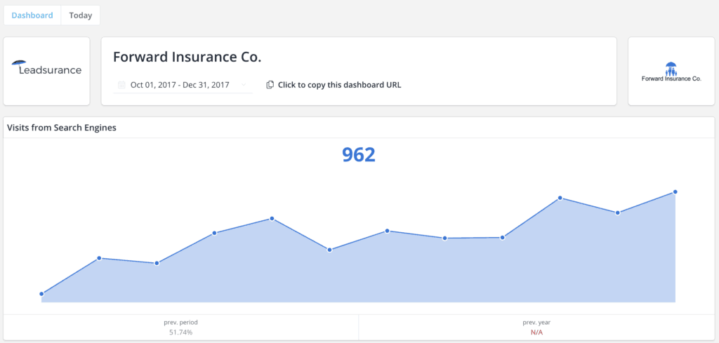
Here is how clean, simple, and effective your analytics reporting is with Leadsurance
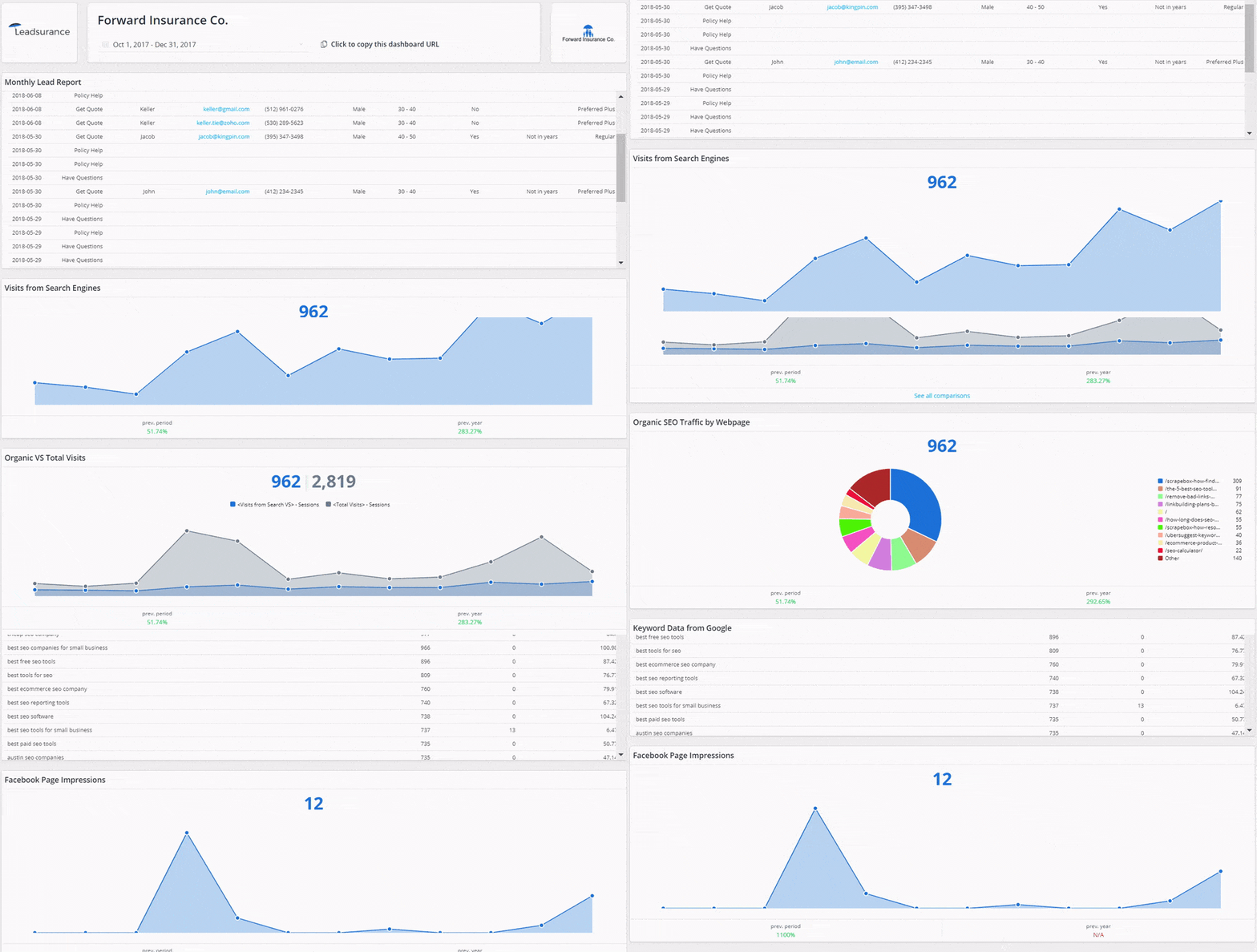
As a bonus, we don’t just report on Google data, we also tie in your social media analytics data and can help you optimize your ad performance from Facebook and Google.
With rich data from Google Analytics and Search Console, you can find your issues, opportunities, and immediate priorities for updating and optimizing your website and content.
You will want to pay attention to any notifications coming from Google Analytics and Search Console such as:
- Indexing issues
- Traffic spikes up and down
- Technical issues
- Accessibility issues (robots.txt)
- Mobile optimization issues
- Speed issues
When you receive these notifications, don’t freak out. They are automated and not always very accurate.
Just make sure to look into the issue and vet it yourself. If there is a problem simply fix it and then you can respond to the notification and Google will re-crawl the page in question and validate your fix.
Easy peasy. Now you can keep an eye on your site and make sure it is performing well.
Now that you have the ‘issues’ part of optimization covered, let’s get into the ‘opportunities’ part.
As for optimizing opportunities, here are some pro tips to make sure your site traffic grows:
- Look at your reports in Google Search Console to see which pages and keywords are driving the most traffic
- You can further optimize these pages by adding more content
- You can also further promote these pages with ads, social media, and building links
It is wise to create some alerts in Google Analytics to notify you of anything that is important happening on your website.
Key Take Aways
- Setup Google Analytics and Search Console
- Pay attention to notifications and resolve any site issues
- Check keyword traffic, position and impression reports for optimization opportunities
- Update your content and continue promoting it for the most traffic
Insurance Website Design Best Practices
A website should be designed like those moving walkways in the airport: users need to be moved seamlessly along from section to section and page to page.
In this part of the guide, I will share the most important design best practices around UX (User Experience).
These practices are important to make sure your website is accessible and easy to use for today’s website user.
Following these best practices will impact your sites search engine optimization (SEO) and conversion rates directly, so don’t fall asleep!
Trust me, a great insurance website is a lot more than high-quality images, although those are important too!
User Experience (UX) Best Practices
You can accomplish great UX on your insurance website by understanding the needs and goals of your website users and customers in general.
I’m going to share some general UX advice in this section to help you get specifical ideas for improving your own insurance web design.
Just like every insurance agency is unique and different, so is each insurance website design.
Following these best practices will ensure that you have a modern design that performs well and improves the customer journey.
Flow of Content and Pages
Users are a lot more likely to notice the items appearing at the top of the page, so design your content in order of importance.
So, it is good to keep your Call to Action messages Above the Fold, meaning in the first screen load of the page without the need to scroll.
In other words, keep your CTA at the top of your pages. (you can put a second one lower down)
For example, many of our sites will have a “Get Quote” type of CTA in the Header area at the top of the page. While also having a second CTA near the end of the page somewhere.
This is a great best practice to follow for increasing conversions. It is very important that your website has a well-performing insurance quoter built in.
Easy-to-use and consistent webpage layouts help users move through content and to focus on it.
Avoid having any dead-end pages on a website that don’t direct the user anywhere. They can create unnecessary work for users and confuse them on what to do next.
You can make your site branded and unique while still using familiar webpage layouts and keeping your pages consistent.
The point is, don’t make users have to learn something new to use your website.
Look at some great insurance websites and use them yourself to get ideas.
And make sure your insurance content is high quality. It should provide informative resources on the insurance policies that you sell to help your prospects make informed decisions and be ready to ask additional questions when they reach out to you.
In a section below we go over some awesome insurance website design examples to give you inspiration.
Scrolling and Page Length
Users are willing to scroll down a webpage if it is clear that below the fold there is additional, relevant information.
A website always should offer a strong visual indication of the scrolling direction and whether there is more content available or not.
The longer a particular page on your site is, the less likely a user will scroll all the way to the bottom of it, statistically speaking.
That doesn’t mean that every page on your site should be short, the page you are on right now is very long and still a well-performing page 🙂
In fact, Google prefers long pages and users prefer to get more info on one page without having to continually click to visit new pages on your site.
The length of a page will depend on the goal of that particular page. When you do have a long page, you can add elements to help users.
We add an ‘arrow up’ in the corner of the screen for our long pages, so users can easily get back to the top.
After all, a running webpage is nice since scrolling is much faster than click is.
Just make sure your webpages are not too long for what they are trying to achieve and add helpful user elements to navigate long pages.
Colors, Shadows, and Element Contrast
Colors might be more important than you realize so don’t skip this section just yet.
First off, with nearly 5% of the population color bling, design with the needs of color-blind users in mind.
Your designs should be converted to grayscale to make sure that important information can be read by all users.
At Leadsurance, we chose colors that are extremely clear in grayscale partly for this reason. (My niece is color blind so I’m a little more keen to this issue)
Some UX professionals suggest that the color blue should not be used for any text other than links on websites.
I myself, and others disagree, the color blue is fantastic and you will likely notice it used generously in the insurance industry.
It builds trust and security, great for the financial and insurance sectors.
However, what is more important than the color of your links is that they are underlined to show users that they are links.
Underlined links are also great to show mobile readers what they can click on.
Taking mobile versions of websites into consideration pay attention to your color choices and screen glare when you are using your phone outside.
Some colors just won’t appear well on a mobile device outdoors, no matter how bright the screen.
Dedicate one color for your website’s CTA and don’t use that color for anything else.
Only use it on the actual CTA button and in any designs surrounding your CTAs.
It may also be used as an accent color or secondary color in small instances, but it should never be used heavily and detract from your CTA.
Try to keep dark and cold colors in the background while bringing bright and warm colors forward.
Page Speed Load and Performance
Ensure that websites users are able to complete their main goal easily and quickly.
What is most important to users is that it feels like your website is fast (even if that is only their perception).
Perception of a website’s speed is based on its load time, smoothness of animations, waiting times, and load behavior.
Display a great first meaningful paint, which is basically a skeleton of the elements of your website in order to communicate the layout while it is loading.
The text on the website should load before the images do so that users can start to read it before the rest of the website loads.
A delay of longer than several seconds often causes a user to leave the website.
You can test and optimize your page speed load and website performance using:
- GT Metrix
- Pingdom
- Google Page Speed Insights
Responsive Design and Mobile Optimization
When mobile interface elements are too close together or small it can be hard to tap them accurately.
The minimum size to a touch target on mobile should be 1cm x 1cm and have proper padding.
If someone uses their pinky finger on your app or mobile website that means your interface targets are not big enough.
When a tablet is held, it is easiest to reach the bottom and sides of the screen using your thumb.
Do not require vertical swiping to be used for anything other than regular webpage scrolling.
On mobile devices, don’t use double-taps. Make sure that users can use a single touch to interact.
When designing a mobile layout, determine whether users will be using their device with two hands or one, in most cases, it is one hand.
But you should ask your designer to pay attention to the media queries for mobile and tablet devices so that the layout is fully responsive to both single hand and two-handed operation.
Navigation: Primary and Secondary
Ease of navigation is important, there should always be an obvious way to access your website’s navigation menu.
Redesign your website if the nav menu dropdown is more than 3-4 levels deep.
Using sticky menus should be considered, especially when quick access is necessary or on longer webpages.
Good website navigation feels like it is in the background and is not in the way but always accessible.
Your website navigation should be consistent and not change throughout the site.
Navigation labels should be made specific. Start with the most information-carrying word and use no more than 2 to 3 words.
If you have many blog articles and content categories then use breadcrumbs to tell users where they are on your website.
For mobile navigation, display only the options that are most frequently used and use a hamburger menu to hide the others.
On desktops, hamburger menus are less familiar, less noticeable, diminish information scent, and increase interaction cost.
On mobile secondary navigation, use in-page menus, submenus or category landing pages.
Use vertical menu dropdown menus, not horizontal ones since scrolling horizontally is much harder.
Try using some high-quality websites that are simple to navigate to get ideas for your menu(s) and the items and words you choose to put on it.
Forms and Calls to Action
Your insurance website is likely going to have a contact form and also one or more quoting forms or another type of insurance quoting tool.
The UX for your forms is critical for your conversion rate as this is the very tip of your funnel, the last place you want to have a mistake.
Losing one of these leads is just like that big fish you reeled in for an hour and right as it was nearing the river bank it slipped off the hook and got away.
Just like you need great lines and hooks in fishing, you need to design great forms to ‘catch fish’ online.
Your form’s field labels should be located outside of the text field instead of inside of them so that users don’t lose track of where they are.
To make a long web form more user-friendly, use separators to split up sections.
On all of your web forms, place required asterisks * and form error messages next to your error-causing fields.
Your error messages should be easy to understand, concise, usable, and helpful.
All error-causing fields should be shown at the same time, next to all of the problematic fields so that the warning isn’t missed by mobile users.
Since your forms are the final point at which your visitor decides whether or not they will convert on your website, it can often be a great place to display social proof and customer testimonials.
Don’t just create lead forms on your website, also offer a place with customer service tools to support your existing policyholders.
Insurance Website Design Inspiration
Now that you have learned about some of these best UX practices, let’s take a look at some great examples in the wild.
These awesome insurance website designs follow the best UX practices and will provide inspiration to anyone working on an insurance website design.
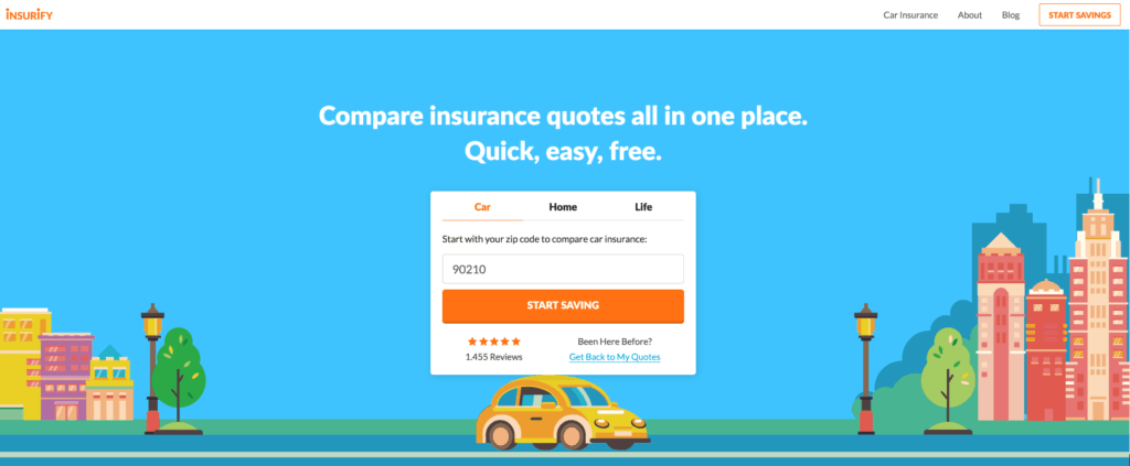
Insurify is everything that the insurance industry is not: it is quick, frictionless and simple. It is a great example of InsurTech.
This website scores at the tops of the charts for advice, choice, and ease of use. No other online experience does as good of a job at locating the best auto insurance with this degree of transparency, ease, and guidance.
The only reason that insurtech companies such as Insurify even exist is due to the fact that the user experience offered by traditional insurance websites are lacking.
Insurify removes the complexities and friction by offering a streamlined, laser-focused UI that uses the finest techniques of AI and progressive disclosure to find users the best quotes and provides them with the ability to compare their options.
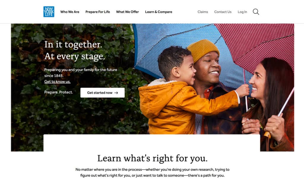
The New Your Life (NYL) website is not just on our inspirational designs list, it helps set the bar as one of the industry’s best insurance websites.
This straightforward, clean, and uncluttered website sets a mile high bar when it comes to user experience with highly effective images, memorable taglines, and an ingenious conversational tone that is warm, sincere, and gets to the point of what matters to those reading. It offers users a unique flow designed to be concise, direct, and conversational while guiding users down its funnel.
NYL knows exactly how to keep website visitors fully engaged with storytelling pages that are beautifully designed. The NYL design scores at the top of the charts for numerous UX best practices: scrolling progress bar, highlighting the most salient points, text readability, and intuitive navigation.
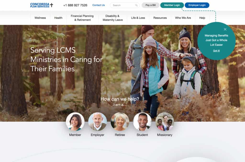
Concordia Plans Services (CPS), in terms of user experience, consistently ranks as one of the best insurance websites. The user-centric information architecture (IA) of the website is based on distinct types of users and its intuitive audience-based navigation aligns fully with the journeys of its customers.
There is a wizard that integrates prominently into the website that has been designed to assist users pending on what tasks need to be completed and who they are. This puts the user fully in control, provides them with useful advice and helps to humanize the user experience.
Insurance marketing professionals have praised the CPS website for being one of the very best in the industry for advice, choice, and ease of use.
Key Take Aways
- Keep your insurance website design simple, less is more
- Follow these general UX guidelines to create an easy to follow and navigate website
- Gather feedback from your visitors and review your Analytics data to optimize your design
This guide contains all of the info you need to build your own insurance website. It is also roughly 7,000 words long and even if you follow every word you will likely have questions.
How much is your time worth?
I believe that you can build your own site, but just expect this to be something you spend time on daily and indefinitely.
Alternatively, you can set your budget and choose Leadsurance or a really expensive and slow designer.
Key Take Aways
- Leadsurance is the fastest and lowest cost insurance website design agency
- Leadsurance designers customize your insurance website for you
- Save time and money managing everything on one bill (vs hosting + domain + them + designer + developer + writer + SEO, etc..)
- Get ongoing support, website updates, daily backups, and content updates done for you
- Get technical help setting up your Analytics with an easy to understand real time dashboard for tracking results
- Get state of the art proprietary insurance quoting technology
Start Building Today
This guide covers all of the bases when it comes to insurance website design.
With this information, you have a blueprint for building your insurance website.
The only thing stopping you now are lack of resources and perhaps some excuses 😉
The good news is, Leadsurance can have your brand-spankin’ new website online within 1 week.
It will meet all of the best practices for insurance web design so that you have a highly secure, fast, mobile responsive, functional insurance website that serves your policyholders well.
And of course, a state of the art insurance chatbot to assist policyholders and convert more leads with instant quoting technology.
